Pages

Glorious Descent

Glorious Descent
Acrylic on canvas 60 x 40cm

Wednesday, November 16, 2016

Art Club October / November 2016

For the past month or so I have been facilitating the very exclusive 'Art Club' for a local Newcastle Primary School. Every Wednesday morning before school a group of very wide eyed and bushy tailed  students aged 6-12 gather to release their inner artistic genius, with of course a few squeals, jokes and tumbles in between.


I was excited to lead 'The Royalty Project' which involved researching different cultural leaders and their traditional dress throughout the world. We looked at Indian Princesses, medieval Queens, Sultans, Indian Chiefs and Ancient Egyptian kings, paying particular attention to the kind of head dress they would wear. We then designed our own head piece and thought about what represented our identity and what we valued. Using collage material we built our own crowns and hats before choosing a friend and painting their portrait as an 'Art Club Royal'. The process was very amusing and messy and it was interesting to see how the children combined different cultural symbols into their design (including of course pikachu).


On our final day we held an Art Club photo shoot, which involved building a throne from the donations of trash n treasure in the classroom. I was very impressed to witness one girl lay out the crown jewels that were to be dressed on the king or Queen upon ascent to the throne. One by one each student was robed in a dressing gown and dressed in jewels before assuming their rightful place on the doona covered thrown. With their hand made creations atop their head they all made very stylish and entertaining rulers.


Monday, October 31, 2016

Current Show ON NOW :


A big thankyou to Modern Times in Melbourne and all who attended the opening of HOME last week - The exhibition featured some quality artists in a beautiful space - The exhibition continues till the end of the month so drop in for a look - You can find out more about the artists and their works at http://moderntimes.com.au/blog/art/3473


Friday, October 21, 2016

San Clemente's Icons - completed works


San Clemente's Icons
Introducing the completed works from the September San Clemente High School Residency.

In this collage series, my attention was on the interior style and architectural features of the historic school building, combined with the surrounding industrial landscape. I have used the archways, religious iconography and repeated patterns throughout the school's gardens, brickwork, lead lights and architraves as a framing device for the views beyond.  Layered collages of watercolour, pastel and charcoal reference the working suburban neighbourhood of Mayfield and the ever-changing skyline of industry.

One of these collective collages is a gift to the school in appreciation of my time spent with the community of San Clemente.


Monday, October 3, 2016

I'm an OFFICIAL reject


This October, my work Mangrove Creek, a painting made during last years residency on the Hawkesbury River, has been selected for display in The Salon Des Refuses exhibition for the Plein Air Painting Prize. You can see the finalist exhibition and the rejects (history proves that these are cooler and more successful in the long run anyway) for FREE until October 28 -  2016 at Sydney's State Parliament House.


Monday, September 19, 2016

San Clemente Artist Residency September 2016

San Clemente sketch 2016 Watercolour and pastel on paper 20x30cm
This September I was an artist in residence at San Clemente Catholic High School in Mayfield. The premise of the residency was to engage with the students and share my experiences as a professional artist, whilst developing new works in response to the school. My time at San Clemente however, far exceeded these expectations, as I lead art classes, interacted with a whole hearted community of students and staff and advanced my own creative and professional practice.


What first attracted my attention at San Clemente was its location: Situated on a hill in Mayfield East, surrounded by a grid of ramshackle suburbia with views to Newcastle's working industrial port. It was a gritty landscape and one that I could see influencing a new series of paintings, not dissimilar to previous works. So, for the initial few days of the residency I worked from the second story veranda that had a glorious view overlooking rooftops, coal loaders, ocean and sky.


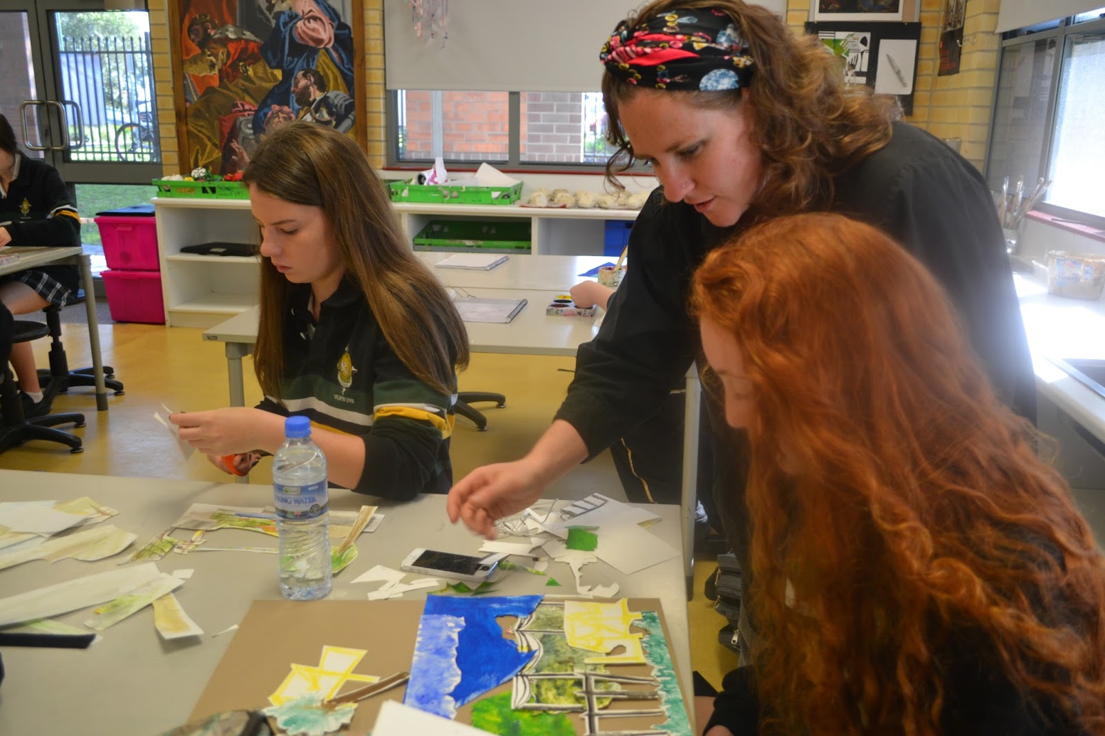
On one of these days I was joined by the year ten art class, who were studying the unit Where We Live. Together we made sketches, in pastel, watercolour, charcoal and graphite, as I cracked the artist whip, encouraging students to work fast and create numerous impressions of the landscape. Some found the task challenging and complained  ''It's not my fault I can't finish Miss, the cranes keep moving !"

Later in the residency, these field sketches (finished and un finished) formed the basis of a collage project that I directed in the classroom. Some what nervously the students cut up their sketches and reconfigured the shapes so as to develop unique perspectives of the landscape.


Toward the end of my first week rain kept me indoors, where my attention turned to the interior style and architectural features of the historic main building. I became captivated by the archways, religious iconography and repeated patterns throughout the school's gardens, brickwork, leadlights and architraves. The archways and date palms reminded me of Matisse and so I took to making cut outs of the shapes that I saw. With an array of shapes to choose from I then set about developing an autonomous symbol, one that represented my experience at the school and could be repeated in a series of works.


In addition to my own project and working with the year ten class, I also had the opportunity to direct a project for the year nine art class, that would complement their unit of study in portraiture. Digging through my archives I decided to share with them my experience of painting animals and lead a drawing and painting activity focused on bull portraiture. Standing in front of a classroom of teenagers giving a drawing demonstration was defiantly a challenging experience as was breaking down my painting technique into an instructional form. However, it did give me a renewed sense of confidence in my own abilities and as I watched the students apply my directions in their work, I must admit I was really proud !


Despite following a certain procedure in this project the portraits that the students drew and painted in this activity lacked no individuality or flair and I was really inspired by the unique marks and sensitive palette chosen by the students. Despite many being quiet or shy during class their personalities shone through in the work and it was such a pleasure and a privilege to be able to communicate with them through the means of art.


By the end of week one my studio / staff tea room, resembled more of a paper nest, with collage pieces and cut outs spread everywhere. I had decided to combine the interior and the exterior space of San Clemente by producing a series of collages based on the surrounding landscape and layering a cut out symbol over the surface of each. Throughout this process teachers and staff would pop into the studio, either to make a cup of tea or to say hi, and witnessed the evolution of the work. We exchanged ideas and experiences and the studio became a meeting place that enhanced my appreciation and involvement with the community of San Clemente.


The finished work is a gift to San Clemente and is a selection of collage tiles that feature many environmental viewpoints with a repeated rhythm of pattern. The sequence echoes the diversity of the school united by the strong community. The colour and brightness of the piece also demonstrates the connectivity that the work has with the people of San Clemente, who were an integral part of my positive experience whilst on residency and who ultimately make the school what it is.


San Clemente 2016 (detail) watercolour collage on Indian rag 25x15cm 


San Clemente 2016 (detail) watercolour collage on Indian rag 25x15cm


San Clemente 2016 (detail) watercolour collage on Indian rag 25x15cm


San Clemente 2016 (detail) watercolour collage on Indian rag 25x15cm


Sunday, July 24, 2016

Feature Artist at Modern Times

This month I am the Feature Artist with Modern Times in Melbourne - As well as having my work showcased in store I have an online interview and catalogue of new works on their website - you can read all about it in the link below...


Sunday, July 10, 2016

On show at Modern Times


This month in Melbourne, Modern Times ( moderntimes.com.au/) has installed a new collection of my work in their beautiful home and design store. Six new large abstract works have joined the floor and have been custom framed (by my talented Father) in waxed Tasmanian Oak. It is very exciting to see the pieces alongside some exquisite vintage Danish furnishings which marry beautifully with the timber framing and the soft organic forms and palette of the works. With me are other talented Australian artists such as Billie Justice Thompson and Tom Blachford (pic below).


Sunday, May 8, 2016

Studio Developments and New Work

Illusions of Desire 2016 Acrylic on canvas 120x120cm

It is with great excitement that I present a recent work from my studio: Illusions of Desire.
It is a complex piece that I find enjoyably un nerving. Immediately sweet and enticing, yet uncomfortable to behold, with it's un clarified body imagery and disappearing chasms. One feels slightly voyeuristic, staring curiously into the chasms and folds of the voluptuous shapes, restrained only by imagination as to what the painting may reveal. Like an illusion the  composition is veiled in a layer of titanium white to create pastel hues that revel in ambiguity.  It is precisely this contradiction and visual  menace that I enjoy.


Monday, April 25, 2016

Introducing A New Jewellery Label :


Introducing POP KIOSK  a contemporary jewellery label designed and made by Madeleine
Cruise in Newcastle New South Wales. Inspired by old shop signage and the
details of 1930’s architecture, POP KIOSK combines strong geometric composition
with bold colour to create striking design pieces in timber and paint.
 
Influenced by a love of dance, each piece takes the name of a pop song and
references a time when music was played on the juke box in the local
 milk bar. Pastel tones and playful patterns
reference the iconic décor, flavours and pop rhythms that could be found at the kiosk.  
 
Each piece from POP KIOSK is a unique product, made from hand cut timber that
is shaped with bevelled edges and sanded for a soft finish. Painted with acrylic
paint and completed with a matte varnish the final surface is polished and water
resistant. The current collection from POP KIOSK consists of a range of brooches
and will soon expand to include a series of earrings and necklaces.
 
POP KIOSK is now available for purchase online through it’s Etsy store.
You can also follow pop_kiosk on https://www.instagram.com/


Devil Inside Brooch $45.00 
A snappy orange tiger brooch for your wearing pleasure ! Hand cut and painted timber shapes with bevelled edges make this one of a kind brooch. A geometric bold composition that will pop ! On your shirt.


Sorry Brooch $45.00
Think Justin Bieber's dancing pop models from 'Sorry' and you'll be ready to embrace the orange and purple of this hit brooch. Hand cut and painted to resemble a lightning bolt and finished in a matte varnish. This is a one of a kind design and signed by the maker.


Love Me Tender $40.00
Reminiscent of the milk bar street sign that glows overhead on the footpaths of yester year. An irregular square and pentagon make up this particular composition, hand painted in blue, black and finished with a matte varnish. This is a unique item, signed by the maker and ready to wear !
I Think I Love You Brooch will beat like your on your chest
Papa Don't Preach Brooch $35.00
This handmade timber brooch is inspired by a 1950's Milk Bar, with it's polka dot sprinkles, pastel blue lino and mandarin sherbet, crafted into a wearable icon. This hand cut, painted and lacquered brooch with soft bevelled edges is one of a kind and signed by the maker. Let it shine on a white blouse or sports jacket whilst drinking a milk shake !